Work with header and footer menus
The documentation in this topic refers to a feature that is currently in Early Availability status. Features in Early Availability status are only available in production to a limited number of customers based on fit with specific use cases. For more information about Early Availability status, see Product lifecycle phases.
Marketplace Managers can use the Storefront Builder to define menus to appear in the header and footer for a Plaza-based theme. They can define menus for the header Auxiliary, Home, and Navigation bars, and for the footer main and Bottom bars by using the Menus & Pages tile in the customization pane of the Storefront Builder.
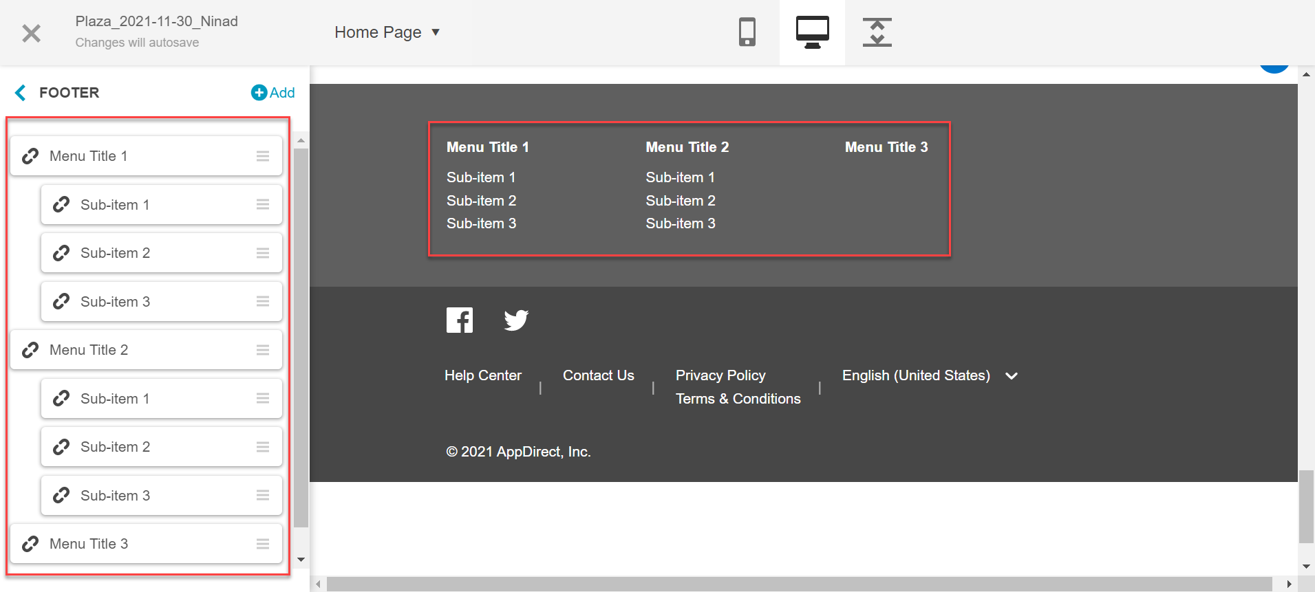
When you click the tile, the pane displays a list of components where menus can appear. These are all components of the header and footer: for example, the Auxiliary Bar or Bottom Bar.
To create a menu, adds individual menu items and organize them. Each menu item consists of a Name (the label to appear in the menu), and the Link (the URL that it goes to when a user clicks it).

After menu items are defined, you can move them around to create the menu structure. There can be two levels for every menu:
- Top-level (“title”) options appear in the menu bar.
- Items below a top-level option (“subitem”) appear in a drop-down list below the title option.
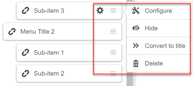
A given item can be changed from a title to a subitem or vice-versa, moved to a different place in the menu, hidden, modified, or deleted.
To modify a menu item, click its cogwheel icon and select an option from the drop-down list.

The text size and color of menu items depends on the settings for that header or footer component. See Header & Footer for more information.
Was this page helpful?
Tell us more…
Help us improve our content. Responses are anonymous.
Thanks
We appreciate your feedback!