Create a slider
You can create a slider, a horizontal list of products that end users can scroll through, to the home page of the Plaza theme. You can use sliders to list popular products, products that belong to a certain category (cell phones, office productivity software, sale items, and so on), or a hand-picked selection of products that you want to promote.
You must have the Marketplace Manager role to create a slider.
To create a slider do the followiwng:
- Add a slider to the home page.
- Select the products to include in the slider.
- Change the appearance of the tiles.
- Change the appearance "quick view" product previews.
- Reposition the slider.
After you complete these steps, you will know how to use the visual editor to add and modify a theme component.
Add a slider to the home page
A slider is a type of component, so the first step is to add a slider component to the home page.
To add a slider
📝 Note: This documentation page may refer to Manage > Marketplace in navigation steps. If the Manage option is not available in your navigation, click the grid icon on the top-left corner of your header and click Marketplace.
- Go to Manage > Marketplace > Theme Manager.
- In the My Themes list, locate the Plaza theme and click Customize. The visual editor opens. The home page is displayed by default.
- In the left pane, click Components. The component list opens.
- In the upper right of the components list, click Add. A list of available components appears.
- Click Slider. A slider component is added to the home page, and the left pane displays the Edit Component menu.
- Scroll down to SLIDER SETTINGS, and change the Slider title to Demo slider. Proceed to Step 2.
Select products to include in the slider
Before we customize the appearance of the slider, the slider must have some contents. Sliders display products, so we will select some products to include. You can select products in two ways:
- Manually select products.
- Select predefined groups of products.
In this tutorial, we will use a predefined group. The options available to you depend on your marketplace configuration and product groups. Use whatever group or category you can.
To select products
- At the top of the left pane under Products, click Add Products. The left pane displays the Content Management menu, which provides options for product selection:
- Manually curated—select individual products to include in the slider.
- Dynamically curated (default)—select product groups to include in the slider. For this tutorial, we will use product groups.
- Under Product Group, click Search Product Groups. A list of available product groups appears, which you can filter with the search box.
- Select one or more of the product groups. The list of products at the bottom of the left pane displays the total number of products in the group as well as a list of individual products.
Note: If you select more than one group, only products that are included in all selected groups are included in the slider.
For the purposes of this tutorial, choose a group that contains more than five products. Proceed to Step 3. 4. When your product selection is complete, go to the top of the column and click the left arrow beside EDIT PRODUCTS to return to the EDIT COMPONENTS panel.
Change the appearance of the tiles
Now that the slider contains some products, you can view the slider at the bottom of the page in the preview pane. Here is the default appearance:

You can use the various options in the left pane to select predefined display styles and then customize the display to suit your needs.
For the purposes of this tutorial, we will display tiles horizontally, increase the size of the tiles, remove the star ratings from the tiles, and set background colors.
To change the appearance of slider tiles
- Under the SLIDER SETTINGS heading, change the Slider Style to Tall.
- Under Size, select Medium.
- Under the display options, clear the Display Ratings box.
- Click the color box beside Product tile background and select a color.
- Click the color box beside Text background and select a different color.
The slider should now resemble the following example:

Change the appearance of the product quick views
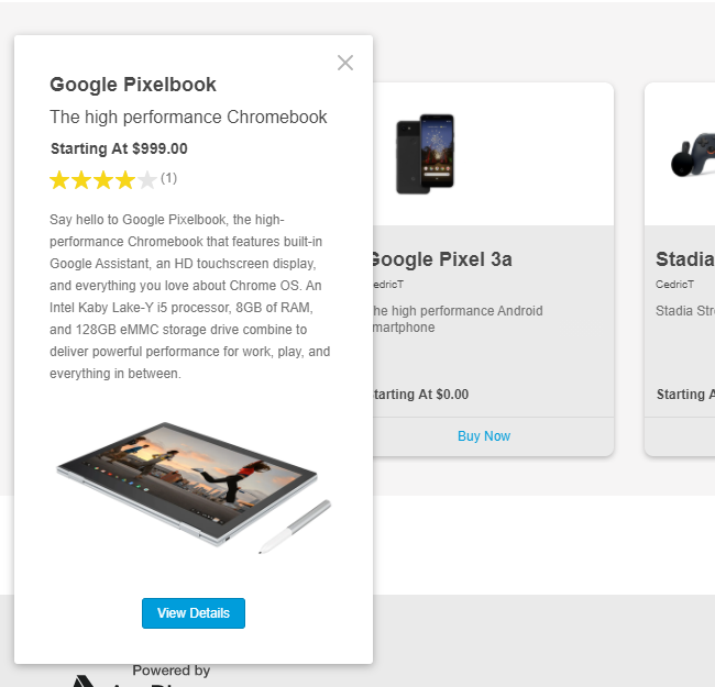
By default, when you hover over a tile in a slider, a Quickview button appears. If you click it, a condensed product profile appears with some additional product information:

You can disable quickviews completely, or alter their appearance. In this tutorial, we will select a two-column display mode.
To change the appearance of quick views
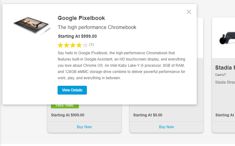
- In the Quickview Mode menu, select 2 columns.
The quickview should now resemble the following example:

When you have finished editing the component, go to the top of the column and click the left arrow beside EDIT COMPONENTS panel to return to the main COMPONENTS panel.
Reposition the slider
By default, any component you add to a page appears at the bottom of the page. We will move the slider higher up on the page. Depending on the theme configuration, some components might have fixed positions. For more information on component repositioning, see Change page layouts.
To move the slider
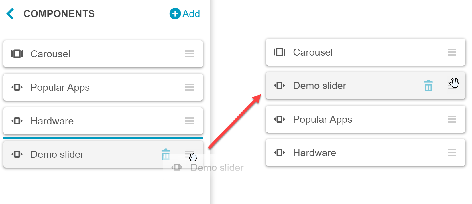
- In the left pane, navigate to the Components list.
- Click and hold the accordion icon beside the new slider.
- Drag the slider to the top of the second position in the component list:
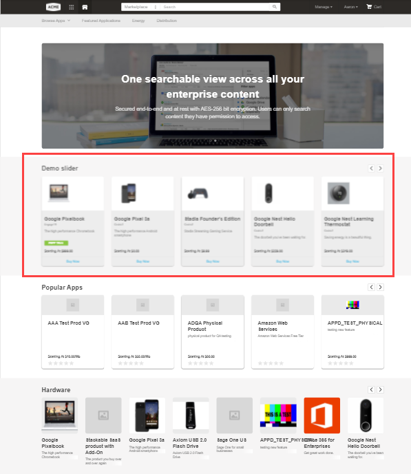
 The slider appears at the desired position in the preview pane, just below the carousel:

Was this page helpful?
Tell us more…
Help us improve our content. Responses are anonymous.
Thanks
We appreciate your feedback!