Build dashboards
❗ Important: The documentation in this topic refers to a feature or product that is currently in Early Availability status. Features in Early Availability status are only available in production to a limited number of customers based on fit with specific use cases. For more information about Early Availability status, see Product lifecycle phases. If you would like to use the product capabilities described here during the Early Availability phase, contact your AppDirect technical representative.
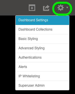
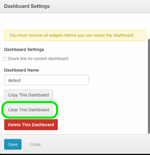
To create a new dashboard, click the “New Dashboard” button at top right, or you can clear your existing dashboard by entering the “Dashboard Settings” menu and selecting “Clear Dashboard”.
Create widgets: service portfolio
Now that you have an empty dashboard to work with, it’s time to populate it with data! Regardless of the data source you will be connecting to AppInsights, the first step is to get a widget added to your dashboard.
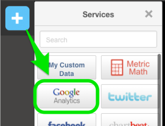
If one of our out-of-the-box service integrations offers key metrics that you would like to add to your dashboards, you will want to start by selecting that app tile from the services panel. Let’s use our Google Analytics integration as an example.
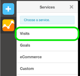
Open the services panel and select the Google Analytics tile. you will immediately be presented with a set of metric categories; select one of these and you will be brought to a list of metrics that correspond to this category. Let’s start by selecting the “Visits” category and selecting the “Site Visitors” widget.
📝 Note: Please note that not all integrations will offer unique metric categories. Selecting an app tile might immediately direct you to a list of available metrics across all categories. You may also notice that the Google Analytics Visitors category offers a dashboard template.
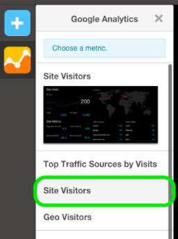
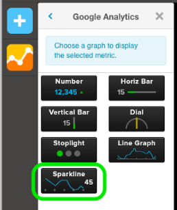
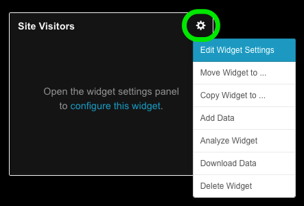
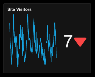
Once you have selected your metric of choice, you will be prompted to select a visual output (or visualization) for the data—let’s select the AppInsights Sparkline visualization. As soon as you have made this selection you will notice that a widget has been dropped on your dashboard with a blue gear icon hovering at the top right of the widget. A blue gear icon means that you have not yet connected a data stream to your widget. To authenticate your Google Analytics account you will need to click the gear icon and select the “Edit Widget Settings” menu.
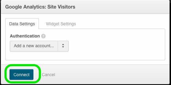
When connecting an account for the first time, you will notice that the “Authentication” window will automatically suggest that you add one. Click the blue “Connect” button to initiate this process.
Please note that there are two different workflows for connecting your web service data to your AppInsights dashboards. You will either use your standard login credentials—the info you use to access this service directly (OAUTH)—or you will be prompted to enter the API key that corresponds to your account.
📝 Note: While the OAUTH flow will be very similar from one service to the next, the process of finding your API key will differ depending on the service you are connecting to AppInsights. For a sample workflow of an OAUTH login, check out our Salesforce connection tutorial; for API login, you can refer to our Close.io connection tutorial.s
Use the Widget Editor: Service portfolio
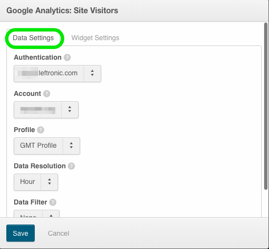
Once you have successfully authenticated your account, it’s time to customize the content of your widget(s). you will immediately notice that the Edit Widget Settings menu provides a new layer of functionality once your widget has a connected data source. The “Data Settings” tab will offer a variety of different options for modifying the structure of the data that is being passed through to the widget.
Using our example, perhaps you are interested in monitoring the total number of site visitors for the past day rather than the past hour (the default setting). To modify your data accordingly, you’d simply need to select a different option from the “Data Resolution” drop-down. Or perhaps you are interested in representing analytics data from another website that is connected to your Google Analytics account—simply select the connected website from the “Account” drop down.
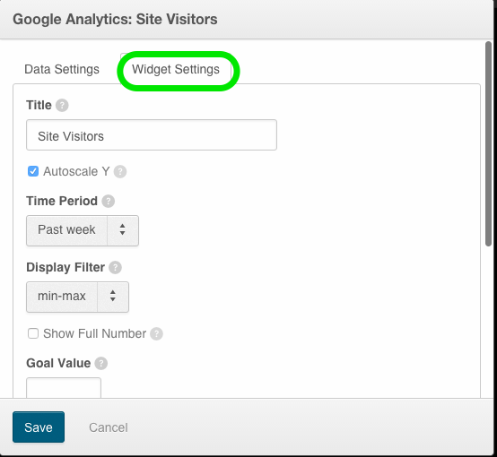
The “Widget Settings” tab will assist you in structuring the visual elements of your widget. Using our example, you could modify the historical timeline of your data—do you want to see your site visitors tracked over the past week? The past month? The past year? Use the “Time Period” drop drown to modify the x-axis to suit your specific needs. Or maybe you want to modify the bounds of your y-axis, change your widget title, or pick a unique color for your sparkline—these can all be accomplished within the widget settings menu.
Please note that the options presented in our data and widget settings tabs will differ by service, and by visualization. As it’s not feasible to provide an explanation for each possible metric / visualization combination, we encourage users to experiment with the various settings that will impact the content and structure of your widgets. If you are having specific issues with the Edit Widget Settings menu that is preventing you from surfacing the metrics that matter most to you, please send a note to our support team.
Once you have selected your service, chosen your metric / corresponding visualization, and made the desired changes to your data and widget settings, click the blue “Save” button to return to your dashboard and view your populated widget. To build a compelling set of dashboards you will follow these steps many times over, combining metrics from various services and sources until your dashboards present a compelling story to your team.
Create widgets: Custom data
It’s possible that our out-of-the-box service integrations will not suit your use case, or will only provide a segment of the data needed within your dashboard environment. Perhaps you have a large collection of custom data sets you’d like to represent within your dashboards, some from spreadsheets, some that reside within a custom database or on-premise server. Depending on the data sources in question, your workflow for getting your metrics into AppInsights will differ slightly.
Databases—To directly query a MySQL or PostgreSQL database, start by selecting the databases tile from the service pane—select the Amazon RedShift tile if this is your database of choice—and then the data type you would like to display (i.e. Number vs. Table vs. Multi-bar). Next select your visualization of choice and your widget will be added to the dashboard. click the blue gear icon at top right of the widget and enter the “Edit Widget Settings” menu to select your database and write the corresponding query.
These general steps are outlined in more detail in our database connectivity tutorial.
CSV Upload—Populating your AppInsights dashboards with data from a CSV file requires the population of your dashboards with the widgets you would like to use prior to connecting any data “streams”. Note that the CSV upload tool does not provide an active data stream as your data will only change immediately following the upload of an updated spreadsheet. Once your spreadsheet is formatted and includes the data stream identifiers for the widgets you would like to populate, you can manually upload your data via our “Upload Spreadsheet” menu.
These general steps are outlined in more detail in our CSV Upload Tool tutorial.
Google Sheet—Similar to our database connectivity workflow, pulling data from your Google Sheet account requires that you start by selecting the Google Sheet tile from the services pane and then choosing the data format and visualization type you would like to use to represent your data. If this is your first time connecting your Google Sheet account, you will need to go through the Google authentication flow, you will then be prompted to specify the cells / data-set from your Google Sheet that you would like your widget to display.
These general steps are outlined in more detail in our Google Sheet tutorial.
Use the widget editor: Custom data
The Widget Settings tab will function very similarly for visualizations that are populated with custom data. Users will have basic options to customize the visual elements of the widget—these will vary depending on the visualization employed.
⛔ Caution: Depending on the format of the data being passed through, the specifications you make within the Widget Settings menu can change the visualization in such a way that might negatively impact the presentation of your data. For instance, uploading one week of data for a line graph using the CSV upload tool and then specifying that you would like your widget time range (x-axis) to cover the last year will yield a graph that is largely empty.
If you have more questions about the best way to represent a certain type of custom data using our available visualization options, please send a ticket to our support team.
Use templates
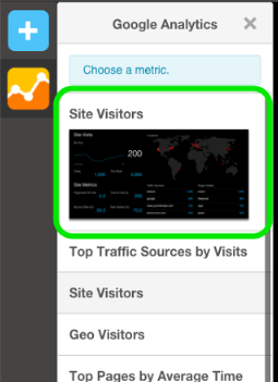
While exploring the AppInsights services panel, you may have noticed that certain integrations offer a dashboard template. These templates are represented by small thumbnails and provide new or existing users with an easy way to fill an entire dashboard with particularly common metrics from the corresponding service.
If you have already authenticated your account for a service that offers a dashboard template, simply click the thumbnail within the metrics menu and confirm that you would like to deploy the template.
⛔ Caution: Please note that you should clear the dashboard of its existing widgets prior to deploying your template, otherwise these contents will be overwritten and your data will be lost.
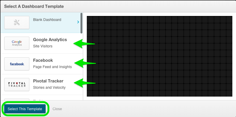
Our available dashboard templates can also be deployed by clicking the “New Dashboard” button and selecting one of the options that follow “Blank Dashboard”. Simply select the template for the service that you are interested in and click the blue “Select This Template” button (authentication will be required if the selected service is not yet connected).
Other widget types
In addition to the AppInsights widgets that will empower you to surface data within the app, there are a number of unique widgets that empower users to run basic data stream computation and add titles, images, or HTML code to their dashboards. These can be particularly useful if you plan to use AppInsights to present data and/or content to customers or colleagues. Label segments of your dashboard more clearly, upload images that will compliment your visualizations, or iframe a video that enhances the power of your data.
Follow the links below for individual tutorials on how to use each of these widget types.
Was this page helpful?
Tell us more…
Help us improve our content. Responses are anonymous.
Thanks
We appreciate your feedback!