Connect to Google Sheets
❗ Important: The documentation in this topic refers to a feature or product that is currently in Early Availability status. Features in Early Availability status are only available in production to a limited number of customers based on fit with specific use cases. For more information about Early Availability status, see Product lifecycle phases. If you would like to use the product capabilities described here during the Early Availability phase, contact your AppDirect technical representative.
If you are frequently organizing important company data using Google spreadsheets, our Google Sheet integration is a great way to dynamically represent this data within AppInsights.
you will just need to connect your Google account, select the data format and visualization type you’d like to use, and then select the appropriate spreadsheet cell(s) that you would like represented within AppInsights. Any time you make a change to the underlying data in your Google Sheet, your connected AppInsights widgets will automatically update to reflect this change!
For users that are new to our Google Sheet integration, we recommend you read this tutorial in full.
Single number
To get started, navigate to the Google Sheet tile within our Services panel ("+ Add Widget" button).
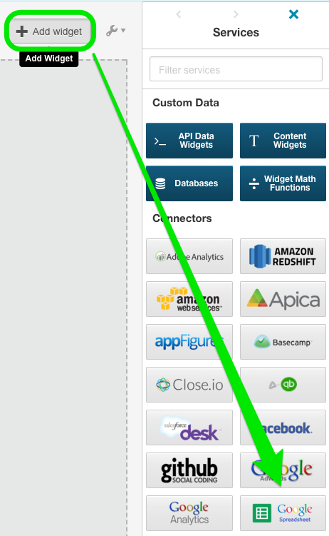
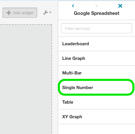
you will immediately be presented with a selection of data formats: Single Number, Table, XY Graph, Leaderboard, Line Graph, and Multi-Bar. Once you have selected the appropriate data format, you can then choose from a number of visualization options.
For our example, let’s use the basic “Single Number” option and then select the standard number widget to represent our data.
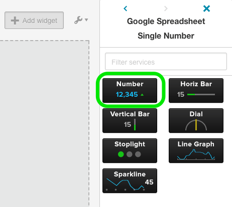
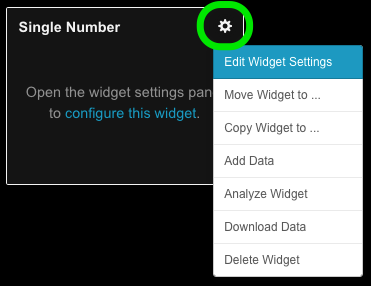
Once you have deployed your new number widget to the dashboard, you will need to authenticate your Google Sheet account (if you haven’t already). To do so, click the gear icon at top right of your new widget and select the “Edit Widget Settings” menu. From this menu, click the blue “Connect” button and a pop-up window will invite you to enter your Google credentials and extend access permissions to AppInsights. You will only need to do this once.
Once you have connected your account, you will notice that the “Data Settings” tab has populated with a new set of options. You can now choose from any of the spreadsheets within your connected Google account. Once you select a spreadsheet, you can then choose an individual sheet (or tab) within that spreadsheet along with the specific cell that you would like represented within AppInsights. (You can also add a prefix or suffix to accompany your data point.)
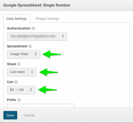
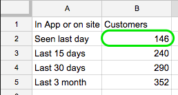
As we are using a basic number widget for our example, all we need to do is select a single spreadsheet cell that contains data and your widget will populate. In our example, we will use the "Cell" dropdown to select the second column, second row of our spreadsheet—B2.
Google Sheet
AppInsights
you are done! Whenever the data changes in your selected cell, your widget will update with the new value. This is particularly useful if you are looking to track the value of a data-point over time. Just select the “Single Number” data format, choose our Line Graph or Sparkline widget, and AppInsights will automatically reflect any changes as your data point updates over time.
📝 Note: The “Single Number” data format is the only use of our Google Sheet integration that will require you to select a single spreadsheet cell. For the rest of the tutorial, we will be providing instructions on widgets that connect to a data set (or range of cells) rather than a single cell value.
Table
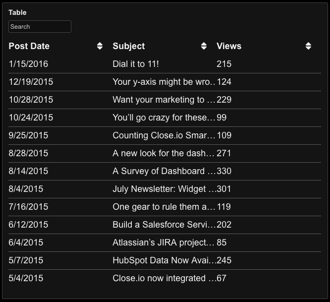
Our table widget is a great way to represent columns of text and/or data that are stored within your Google Sheet. Start by selecting the “Table” data format and selecting our standard table visualization. If you have already connected your Google Sheet account, you will be asked to select your spreadsheet, sheet tab, and a range of cells to populate your table. If your spreadsheet contains header data—i.e. names for each column—you will want to check the “First Row is Header” box so your top row is not treated like standard data.

As our table widget will expect a range of spreadsheet cells, you will need to specify the top left cell and the bottom right cell of the data set. This means that you will need to organize your spreadsheet data in adjoining columns, otherwise you will end up with empty cells within your data set, which AppInsights will be unable to recognize.
For our table example we will select from A1 to C19, which will populate our table widget with three columns, each with 18 rows of data (header row not included).
Google Sheets

AppInsights
XY graph
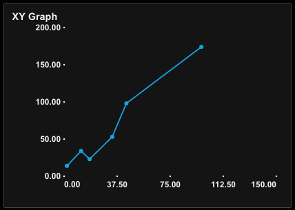
The XY graph empowers users to plot two columns of numerical data along an X and Y axis. (Please note: our XY graph will not recognize dates—if you are looking to track a data point over time, please use our Line Graph or Sparkline widgets).
Similar to the table, our XY graph visualization will require you to select a range of cells. Once again, you will want to specify your spreadsheet, sheet tab, and the top left / bottom right cell of your data range.
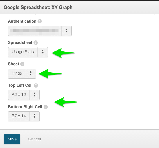
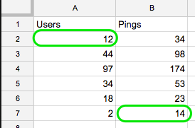
When using the XY graph, do not include any column headers used to label your data as these will prevent your data range from being represented properly (i.e. we ignore “Users” and “Pings” pictured below).
Google Sheets
AppInsights
Leaderboard
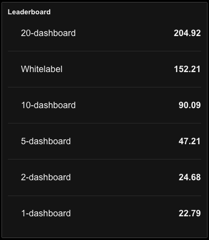
Our Leaderboard data format will allow you to choose from a number of visualizations—Leaderboard, Pie Chart, Bar Graph—each of which is intended to rank the comparative values of a data-set. For our example, we will be using the standard leaderboard widget which will automatically rank the values of our data set from highest to lowest.
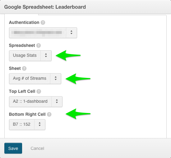
Start by selecting your spreadsheet, sheet tab, and cell range (top left / bottom right). As with the XY graph, do not include any column headers used to label your data as these will prevent your data range from being represented properly.
Google Sheets

AppInsights
Line graph
Selecting our line graph data format will allow you to populate either our Line Graph or Sparkline widgets with historical data, as opposed to selecting a single spreadsheet cell that is tracked over time.
📝 Note: The other widgets listed in this category—i.e. number, horizontal / vertical bar, dial—will function identically to their “Single Number” counterparts.
To get started, select the Line Graph or Sparkline widget, then choose your spreadsheet and sheet tab of choice, along with your range of cells. (You may ignore any column headers.)
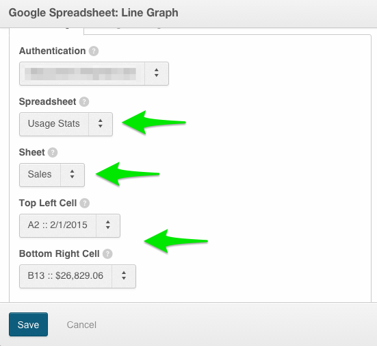
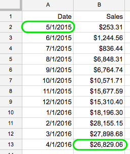
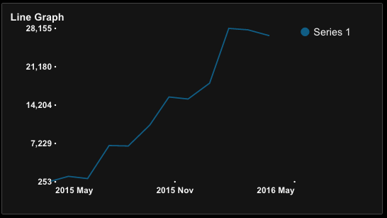
Please note that for these widget types, the AppInsights app will expect you to pass through a date that corresponds to your data (see below screenshots). With this in mind, you must be sure that your widget settings are consistent with the time range of data that you have selected.
In our example, we have provided the most recent 12 months of sales data. To properly represent this in our widget, we need to navigate to the “Widget Settings” tab and select “Past Year” as our Time Period.

Google Sheets
AppInsights
Multi-bar graph
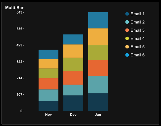
Your final data format / visualization option is our multi-bar graph. If you have a more complex data set and need to plot multiple values against the same x-axis categories, this is the visualization option you are looking for.
For starters, you will want to make sure your data set is arranged to cooperate with our multi-bar visualization. Start by arranging all of your x-axis value categories on the left side of your data range (you can think of these as unique titles for each of your rows). Next, arrange your data sets as unique columns that correspond to each of your x-axis categories.
In our example, we are tracking the number of unique drip emails that were sent over the course of three months.

you will notice above that there is a placeholder cell that lists “Multi-bar” in the top left corner of our spreadsheet. Please note: in order for your multi-bar visualization to function properly, this cell needs to be selected as the top left bound of your data set—it cannot be empty.
Once you have properly formatted your data set, follow the standard steps of selecting your spreadsheet, your sheet tab, and the range of cells you would like represented. (Please view the spreadsheet sample below for clarity on the appropriate top left / bottom right selections).

Google Sheets

AppInsights
A final note on Google Sheet data updates: while AppInsights will automatically reflect any change to an individual data cell or range of cells that has been connected to your widgets, the app will not detect any NEW data that has been added to your sheet. If, for example, you add a new row to a data set that is connected to a leaderboard or line graph, you will need to modify your widget settings to include this new data if you want it represented within your AppInsights widget(s).
Was this page helpful?
Tell us more…
Help us improve our content. Responses are anonymous.
Thanks
We appreciate your feedback!