Build vertical spacers
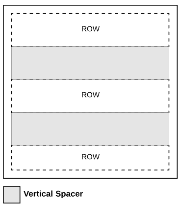
Vertical spacers are layout components. You insert them into cells to add blank space between components. For example, between rows, or as padding above and below text or image components. Vertical spacers cannot contain components.
An example of rows with vertical spacers is shown in the following image.

Prerequisites
You can add vertical spacer components to cell components. See Build cell components.
Default template JSON samples
In the Appdirect Template_EN_US default template, see the following:
- Lines 1058-1064 for an example of a vertical spacer that provides padding above text.
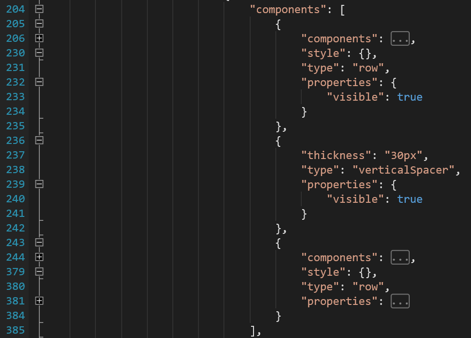
- Lines 204-385 in the following image for an example of a vertical spacer between rows.

To download the default template, go to .
Vertical spacer component JSON schema
{
    "type": "verticalSpacer",
    "properties": {
        "visible": <true | false>
    },
    "thickness": "<value in px/em/mm/pt/in>"
}
Elements to populate vertical spacer components
| Element | Type | Description | ||
|---|---|---|---|---|
| verticalSpacer | object | Defines styles and behaviors for vertical spacer components. | ||
|
type |
string |
Required. Defines the component type as vertical spacer. Valid values: verticalSpacer |
||
| thickness | string |
Required. Defines spacer height as a dimension in pixels, ems, millimeters, points, or inches. Format: [0-9]+(px|em|mm|pt|in) Example: 40px |
||
| properties | object | Required. Define visibility. | ||
| visible | boolean |
Required. Defines whether component appears on invoices. Valid values: true | false |
||